6- Application UI
- s.a.

- Aug 3, 2020
- 1 min read
From our discussion last week, my teammates and I each designed an interface mockup and tried out different colour schemes.
Meditation

Includes: Different meditation options depending on the user's mood, options provided, and UI for Gifs and Relaxing sounds.
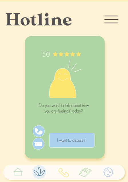
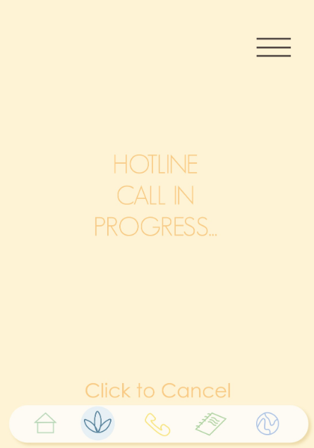
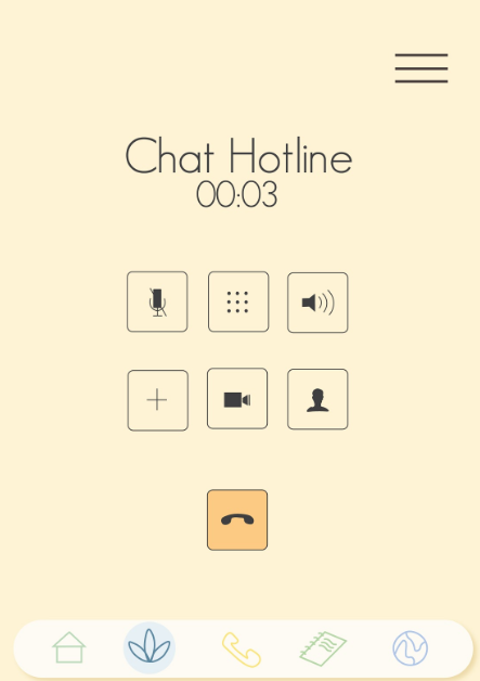
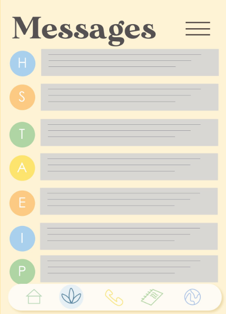
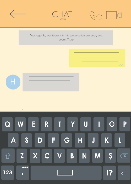
Hotline
Includes: Hotline option of texting and calling, calling interface, and message box
Journal
Includes: Option to go to personal entries, community posts, and calendar, user's entries list, and calendar to show old journal entries and notes.

We also further developed our yellow man sketches. We made him more rounder this time round and also showcase some different emotions on his face.
Based on our progress, the overall feedback that we received was:
the interface was all over the place and we need to choose one solid layout style
ensure the highlighted icon on the bottom menu matches the right page
design only pages that are different in terms of content and layout as opposed to similar ones
keep the dimensions, alignment, icon style, typography font and size, colour scheme and phone operating system UI (iOS or Android) consistent.
Finalize the yellowman sketches
As for the journal section, our lecturer advised removing the calendar part and only keep content that is relevant to Mental Health, since the "notes" section isn't really a mental health topic.







Comments